

Heatmap testing uses color-coded visualizations to spot patterns in data. Where users click on a page. Which test cases fail most. Which suites are flakiest. Two worlds use the same word, and that’s where the confusion starts.
UX teams run heatmap user testing to see behavior. QA teams use test result heatmaps to spot weak spots in coverage. Having different purposes, they use the same visual trick: replace numbers with color, because the brain reads color faster than digits. Let’s walk through both. And see how Testomat.io delivers test result heatmaps into your reports. 👇
What is heatmap testing?
Heatmap testing is the practice of visualizing test or user data as a color-coded grid, where the intensity of color signals the intensity of an event: clicks, failures, attention, or flakiness. Hot spots demand attention. Cold spots don’t.
A Heat Map (or Heatmap) is a graphical 2-dimensional format representation of data where values are depicted by color. Heat maps make it easy to visualize complex data and understand it at a glance. In other words, Heatmaps is about replacing numbers with colors because the human brain understands visuals better than numbers, text, or any written data.
In Software Testing color gives visual cues about how data is clustered or vary over the testing process. Heatmaps can describe the density or intensity of variables, visualize patterns, variance, and even anomalies and also show relationships between variables. By representing data as a “paint-by-numbers” canvas, they make complex information readable. Color variation indicates the magnitude of numeric values: cells with higher values get a hot color and cells with lower values get a cold one. It’s simple and effective.
User heatmaps vs. test result heatmaps: what’s the difference?
When someone googles “heatmap testing,” they could mean one of two very different things. Let’s take at them below:
| Who uses it | What it shows | |
| User behavior heatmap | UX designers, PMs, marketers | Where users click, scroll, look, etc. |
| Test result heatmap | QA engineers, automation devs, managers | Which suites pass, fail, flake, never run |
They have the same visual format with completely different purposes. A user heatmap tells you where attention goes. A test result heatmap tells you where bugs go. They both are valuable in modern QA workflows at different stages.
6 interesting facts about Heatmaps
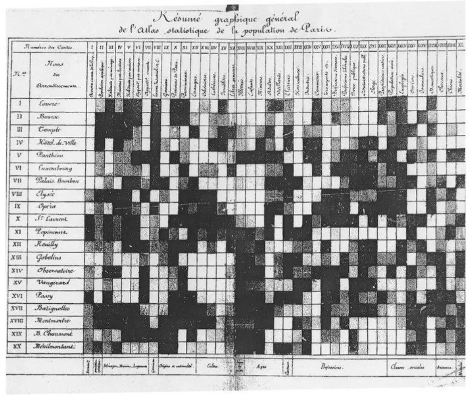
- The practice we now call heat maps is thought to have originated in the 19th century, where manual grey-scale shading was used to depict data patterns in matrices and tables. See, original Heat Map of the 19th century, where manual grey-scale shading was used to depict data patterns in matrices and tables.

- Spectrum rainbow colors are best perceived, so nowadays we can see colored models. Note, good color schemes help you see structure in numeric data. Lighter colors correspond to smaller amounts and darker shades to larger values, or vice versa.
- The term “Heatmap” was first trademarked in the early 1990s, when software designer Cormac Kinney created a tool to graphically display real-time financial market information.
- In the Software Testing, the first mention was for prediction of the reliability of large software products, the technique was evaluated on Microsoft Vista and Eclipse.

- Heatmaps are the most commonly used for studying genomes to represent the level of expression of many genes.
- Also, Heatmaps are popular in marketing researches and sales. In testing as a website UI/UX testing, A/B testing, Performance testing.

Heatmap user testing: tracking how people use your product
Heatmap user testing means watching aggregated user behavior on your live product or prototype, rendered as a color overlay. Hot zones are where people click, scroll, look, etc. Cold zones are where they don’t. While this is primarily a UX research method, the data it provides is invaluable to QA teams as well. Let’s quickly overview the main types doing most of the work:
- Click maps, where users tap or click.
- Scroll maps, how far down the page they get.
- Attention maps, where their eyes or cursor linger.
Attention heatmaps measure user engagement in heatmap user testing: where eyes linger, where they skip. They are useful when you want to know if the user even reads the headline.
What is a website heat map?
Website heatmaps visualize the most popular (hot) and unpopular (cold) elements of a webpage using colors on a scale from red to blue.
Displays user behavior, heatmaps facilitate data analysis and give an at-a-glance understanding of how people interact with an individual website page — what they click on, scroll through, or ignore—which helps identify trends and optimize for further engagement.

So, website heatmaps are popular to carry out UX/UI testing and A/B testing, Performance testing. Visualize users’ preferred browsing and shopping behavior etc.
Heatmaps in usability testing
Usability testing heatmaps sit between research and design. A usability test with 10 to 20 participants on a task such as “find the pricing page” or “complete a checkout” generates click data. If overlayed on the page, the problem areas become visible.
It is useful for:
- Onboarding flows: where do new users get stuck?
- Navigation menus: is the dropdown being discovered?
- Forms: which field do people abandon?
A heatmap usability testing study tells you where users abandon. While it doesn’t tell you why, you need to run a follow-up interview to get the answers.
Heatmap image testing: visual regression context
The phrase heatmap image testing comes up in two contexts:
- Visual regression testing. You can use tools for visual regression testing to compare screenshots between builds and display differences through an interactive heatmap overlay, hot color on pixels that changed. It is useful for catching visual mismatch which a DOM-based assertion would miss.
- Image-based UX heatmaps, where the image is a page screenshot under the click overlay.
If you’re testing a visual product (game UI or design tool), you can use the first type for automated regression testing with your functional tests and the second one for UX research.
Heatmaps in A/B testing
A/B testing heatmaps show how users behave on each variant. Variant A gets clicks, variant B gets ignored. When you compare these to your conversion numbers, you will understand the reason why it happens. For QA teams, every A/B variant is code that can break, and test result heatmaps are how they catch it.
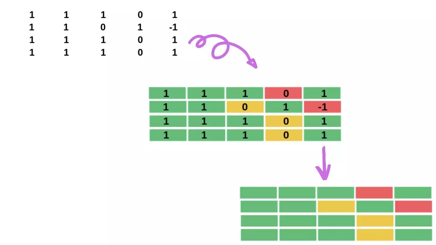
What test result heatmaps show
Good test heatmaps display this:
- Failing tests: clusters of red, often pointing to a broken component.
- Flaky tests: the yellow or striped pattern, where the same test passes and fails across runs.
- Slow tests: a separate widget, often paired with the heatmap.
- Never-run tests: gray cells, displaying undetected coverage failures.
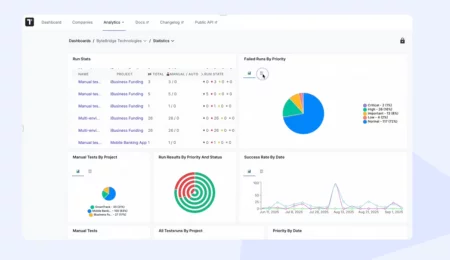
How Testomat.io renders test result heatmaps
Testomat.io shows heatmaps on test reports, by suite. Each cell represents a test or a group, colored by its latest result. Hot color where defects cluster, cool where things are green.
It’s part of the broader Report & Analytics view, alongside widgets for:
- Flaky tests
- Slowest tests
- Never run
- Tests ever
- Failing tests
Also, the heatmap correlates with these widgets so a hot spot has context: why it’s hot, since when, which build broke it. That’s the difference between a pretty visualization and one you can use effectively.
Benefits of heatmaps in software testing
Heatmaps turn raw QA data into something a stakeholder can read in five seconds. They pinpoint failure clusters, coverage gaps, trends without anyone having to scroll through logs.
| Benefits for QA engineers and managers | Benefits for UX and product teams |
|
|
While the data source changes, the color maps to intensity.
🗒 Summary
Heatmaps represent data in an easy-to-understand manner to communicate to team members or clients. That is why visualizing methods like HeatMaps have become popular. The principle is the same whether you’re watching users click or watching tests pass: color shows intensity patterns show meaning. Testomat.io Test Management System provides Test results Heatmaps by test suite on Test Reports. Heatmaps shouldn’t be used apart. Good practice correlate them to analytics and the context of your research, what we successfully developed into our Test Management tool as well. Rich Analytics is available on the Professional and Enterprise plans , plus the Free Trial.😉